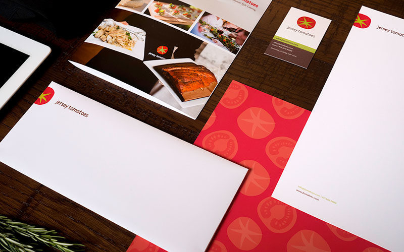
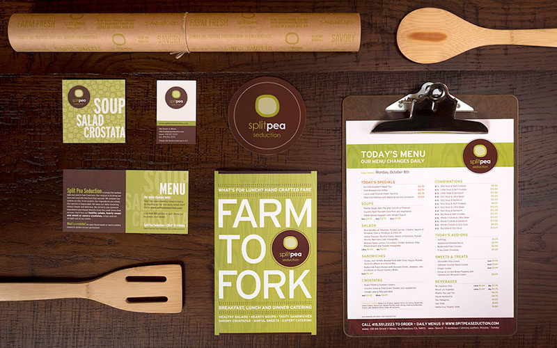
Client
Jersey Tomatoes
Deliverables
Identity Design, Brand Design, Visual Design, Website Design, Print Design, Print Production
Industry
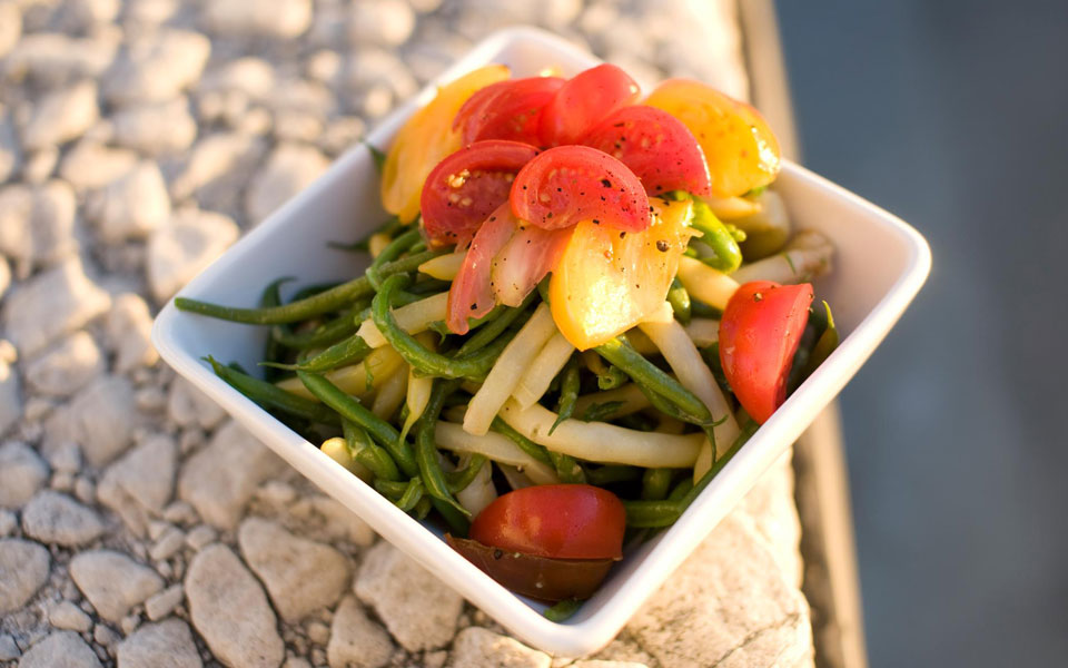
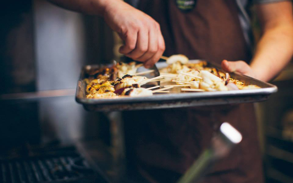
Food
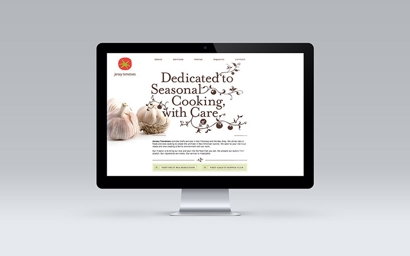
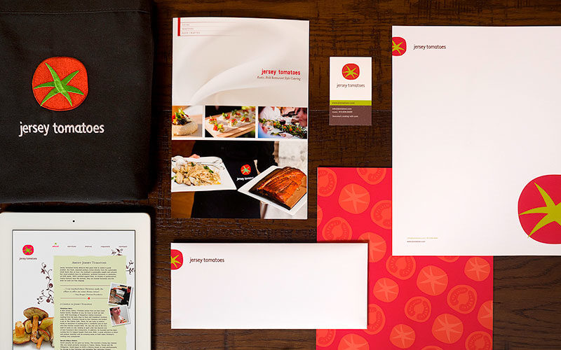


Jersey Tomatoes
Identity Design, Brand Design, Visual Design, Website Design, Print Design, Print Production
Food